

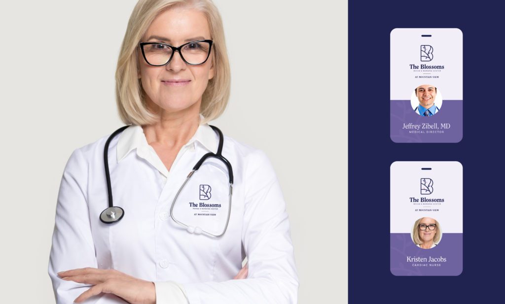
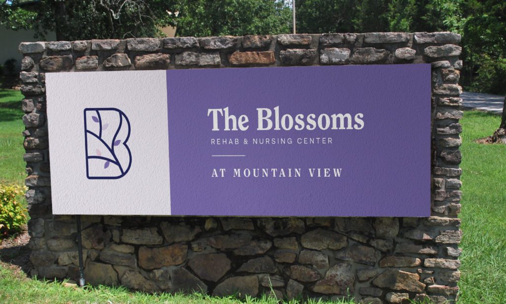
Blossoms
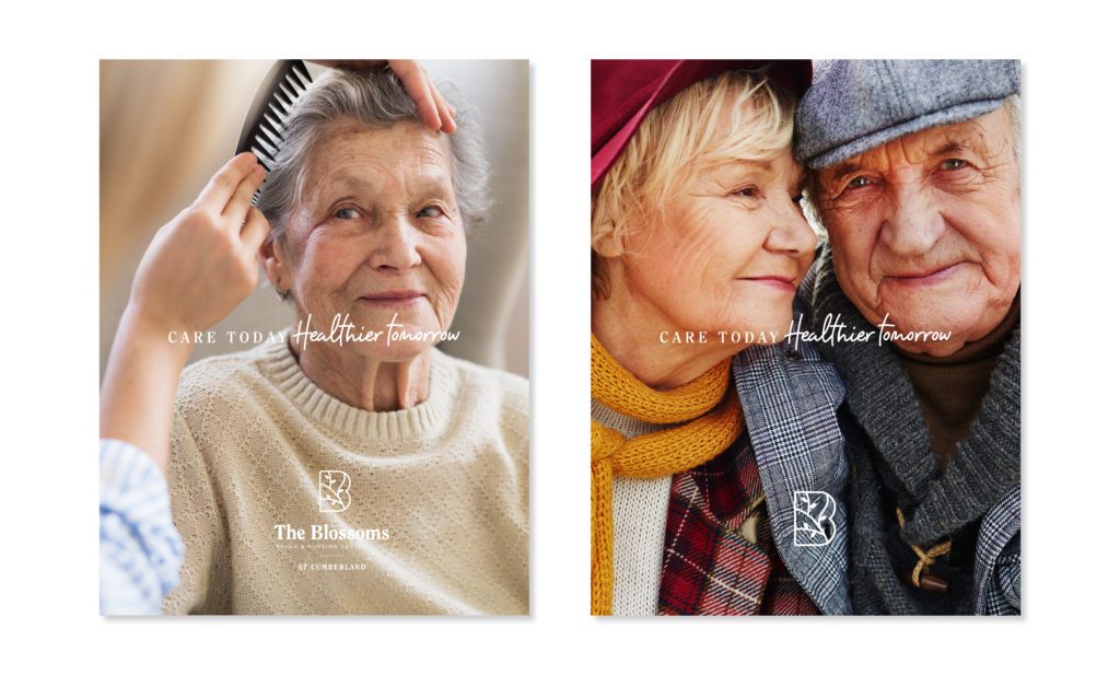
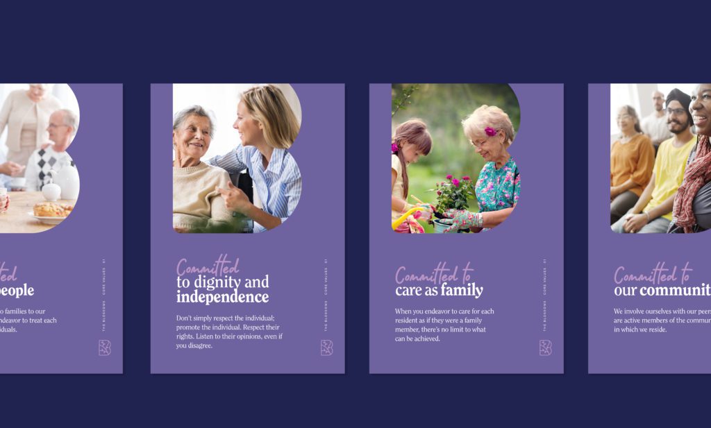
The key to great care is creating a personal relationship between caregiver and resident.
After a significant health episode, it’s only natural for one to reflect back on their former self. At The Blossoms, their mission is to provide the individualized care and support needed for residents to rest, recover, and return to their daily lives.
The Situation
Oasis Healthcare, The Blossom’s parent company, approached us in search of creating a strong brand identity and positioning in a crowded field, based on a strong commitment to care and wellness.
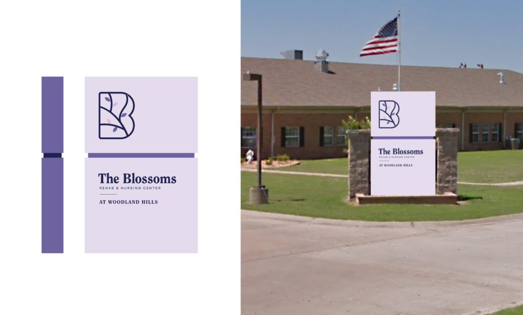
This was particularly important in light of recent instability concerning previous ownership groups. Our objectives included logo system creation for The Blossoms newly-purchased Arkansas facilities and to ensure the brand ethos and identity can be applied to each facility within the Oasis network.
The Solution
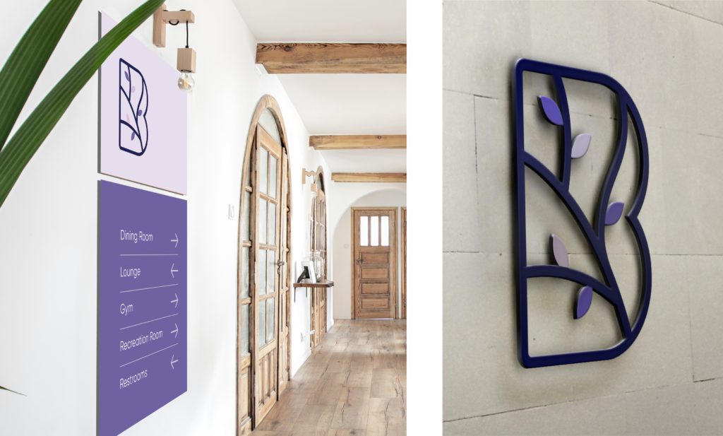
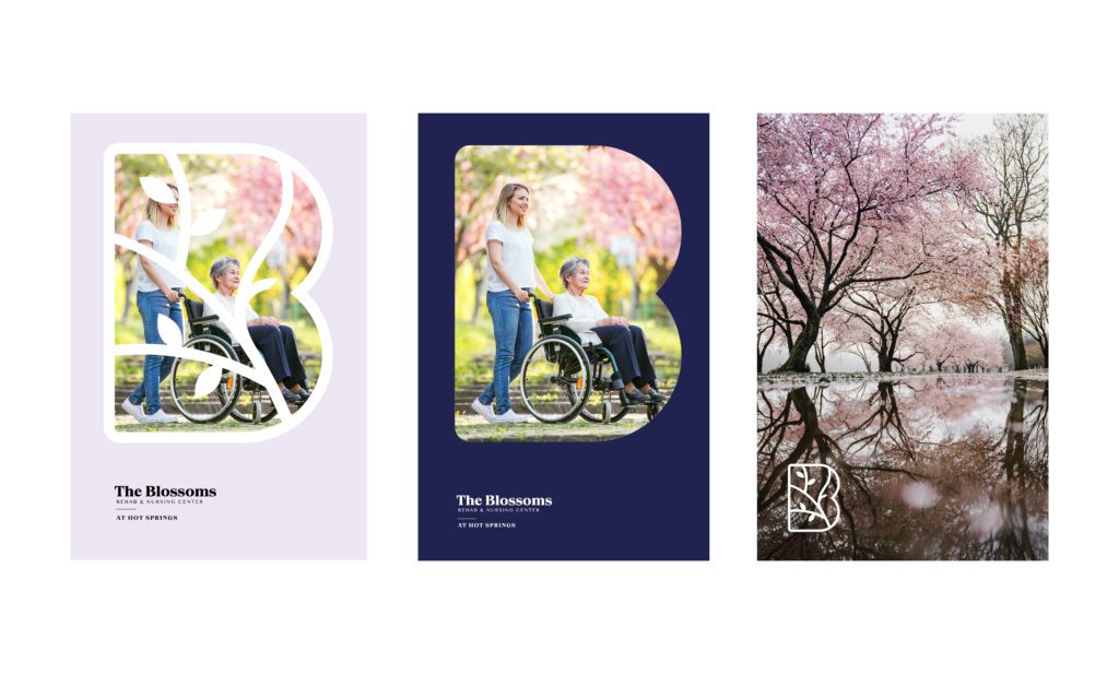
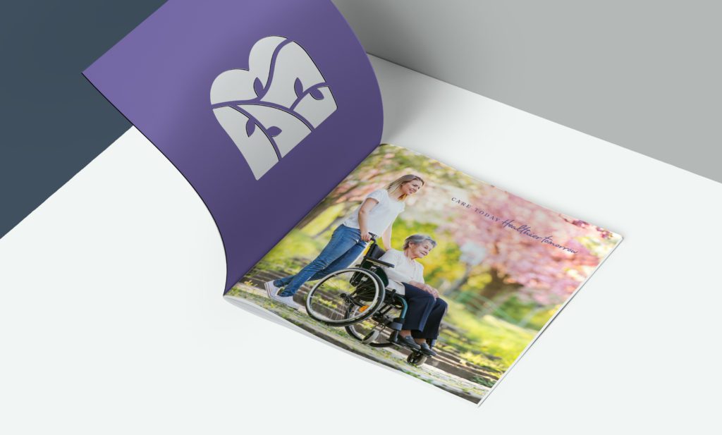
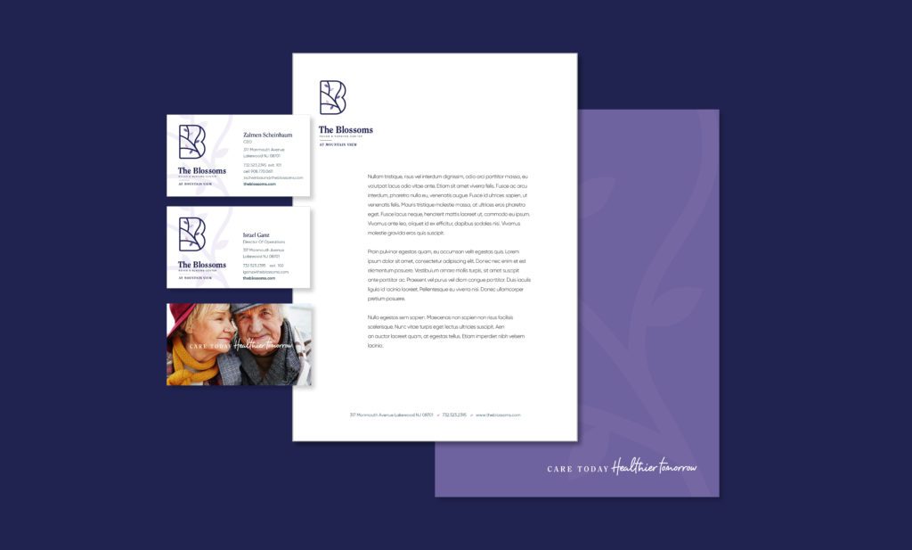
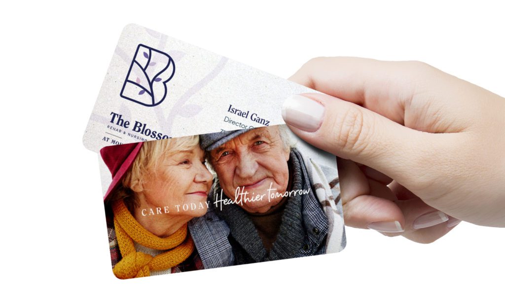
The Blossoms’ new brand identity communicates their commitment to providing top-quality healthcare. We were careful to put a strong emphasis on their stability and decades of experience as facilities while revitalizing and modernizing the look and feel of their overall client-facing brand. An example of this is within the name ‘The Blossoms’. The Apple Blossom is the tree of Arkansas which signifies being united and hands-on — something the employees are very proud of.
Our goal was to transform their previous look into something unique, soft, and approachable. We wanted to ensure that everything that’s emphatically theirs (their friendly, personable, and caring touch) was effectively represented throughout their entire brand. The employees and residents of these Arkansas facilities were enthusiastic about their revitalized look.


Heart & Soul Overload
We know you want a peek, but the amount of heart and soul poured into this project is simply too much for the screen to handle.
While we figure this out, fill out the form below and we'll gladly take you behind the scenes.
You can expect a call back within 1 business day