Rosemary
The Situation
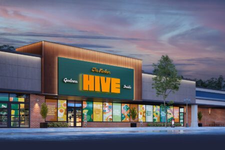
As a new supermarket seeking to enter the Williamsburg market, Rosemary was entering a playing field saturated with top players.
Shoppers in Williamsburg were highly discerning, with years of experience shopping in beautiful stores with a wide selection, bright aisles, and delicious takeout.
To stand out among the rest, we needed to take Rosemary above—and beyond.
Our Take
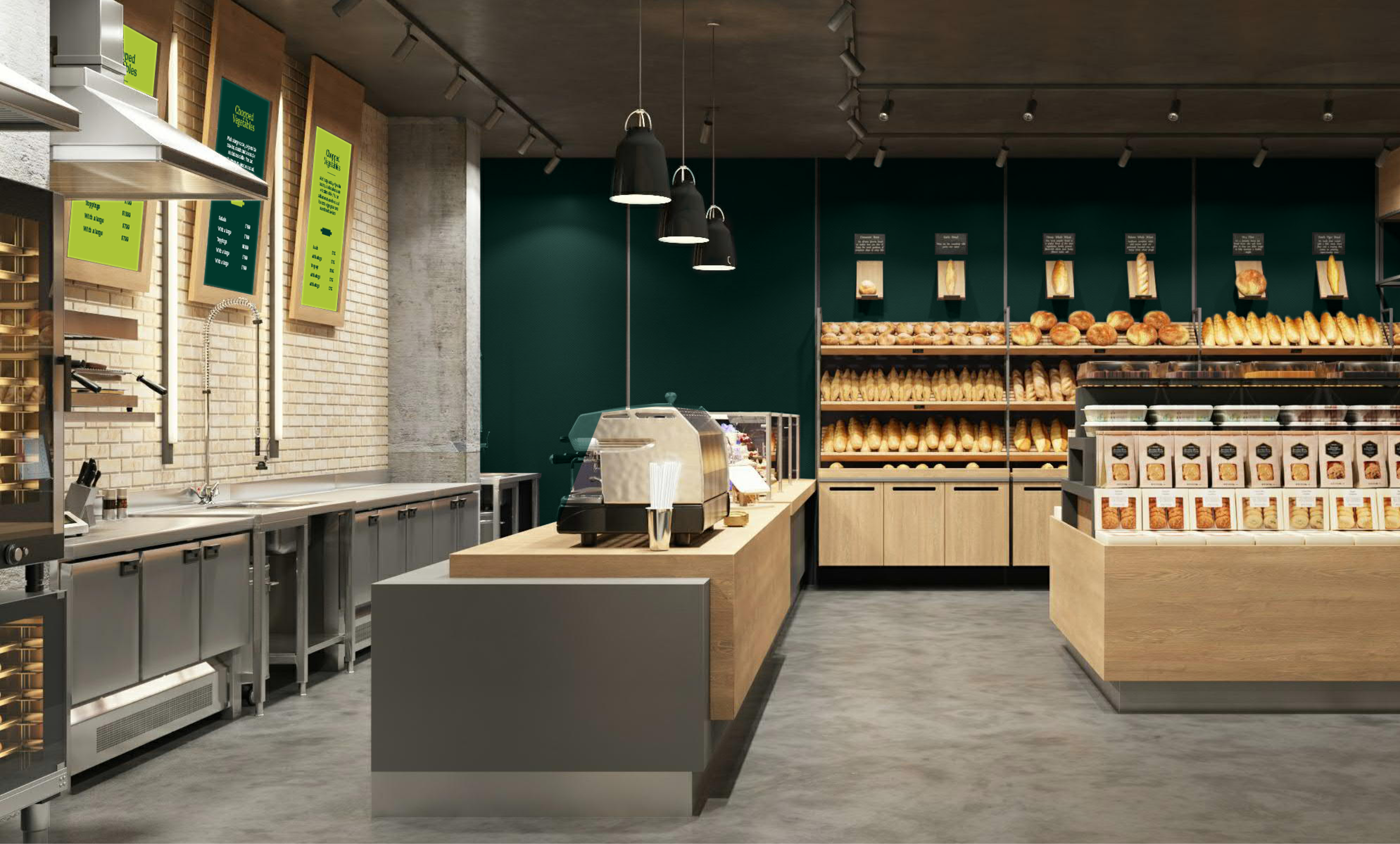
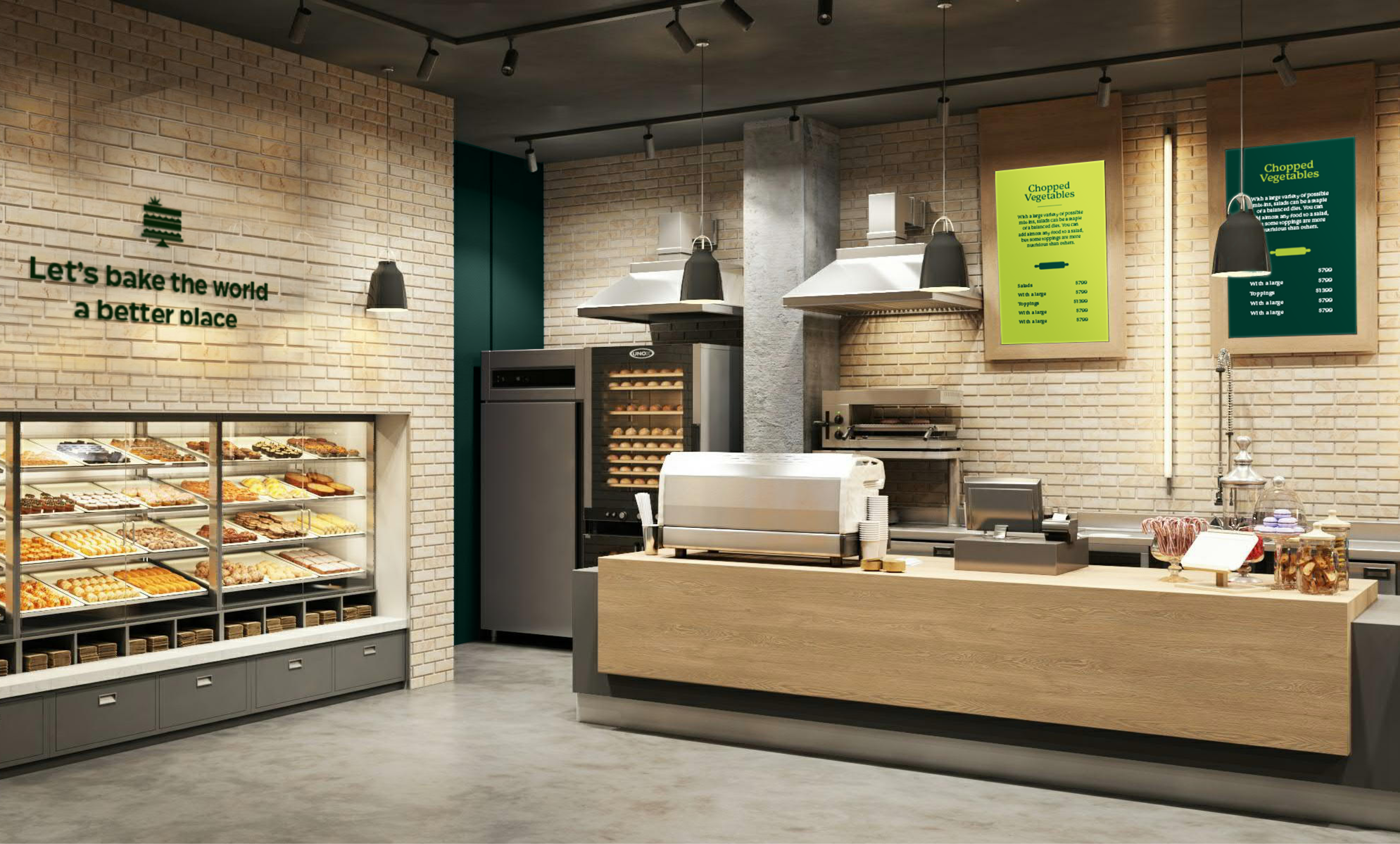
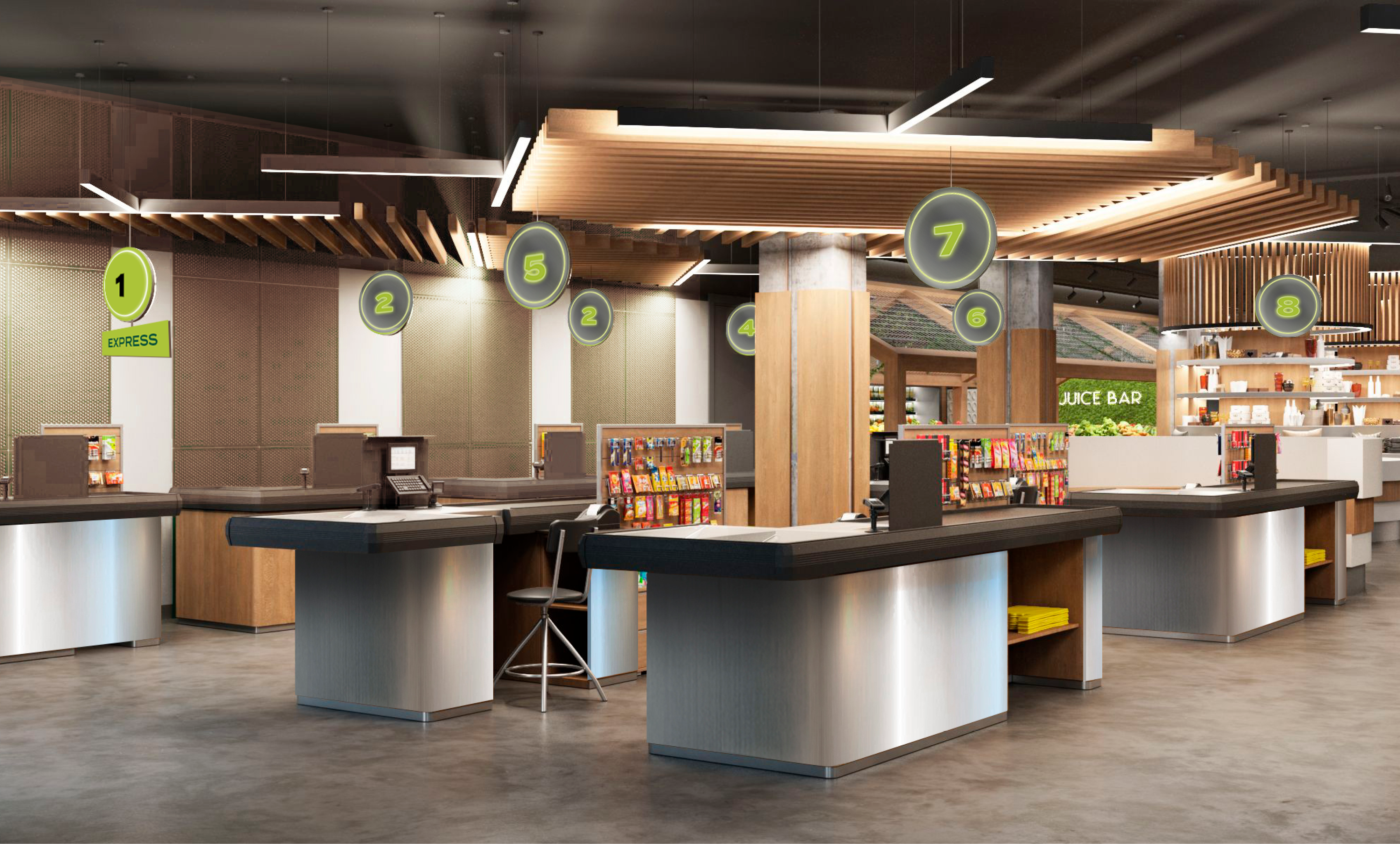
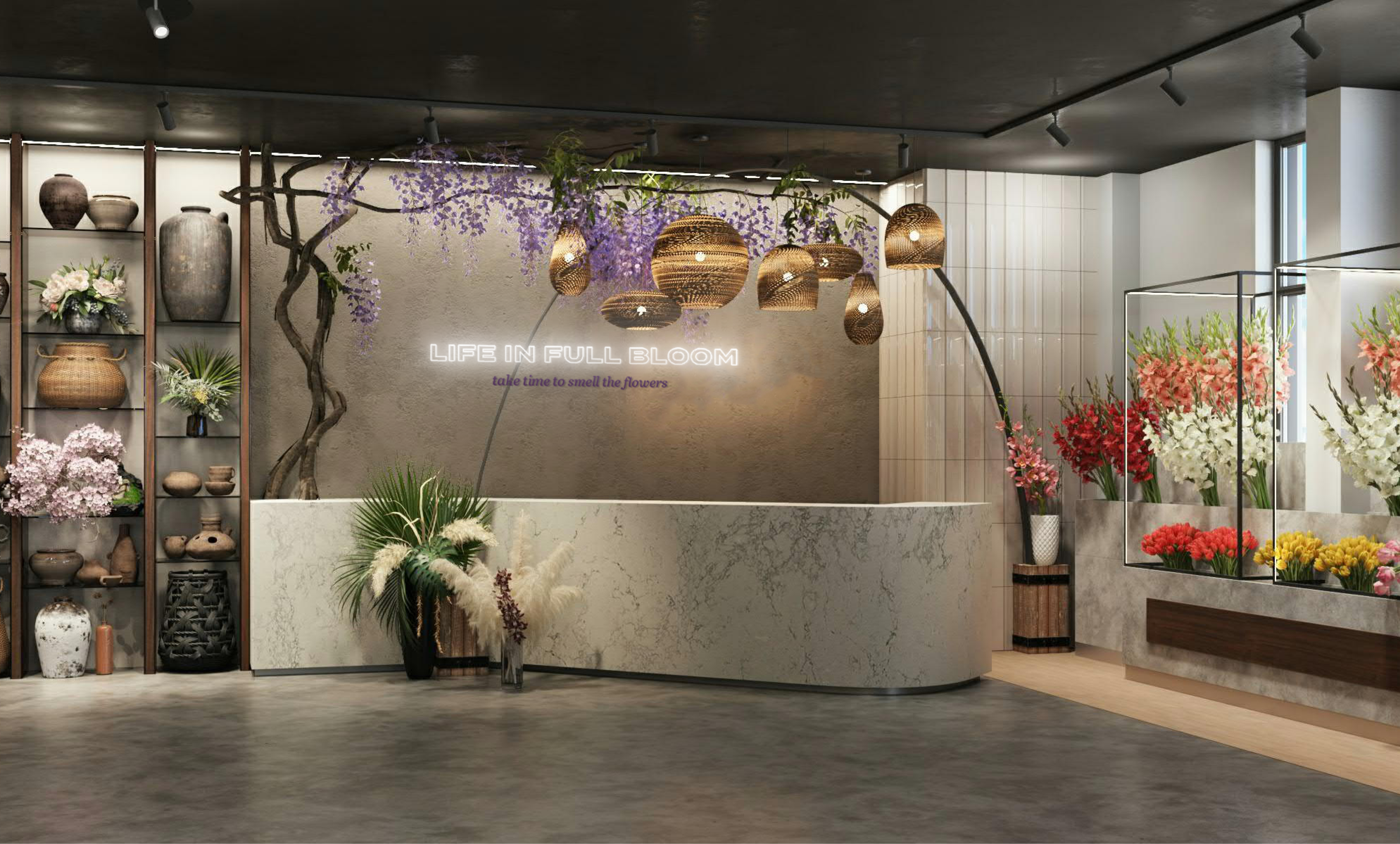
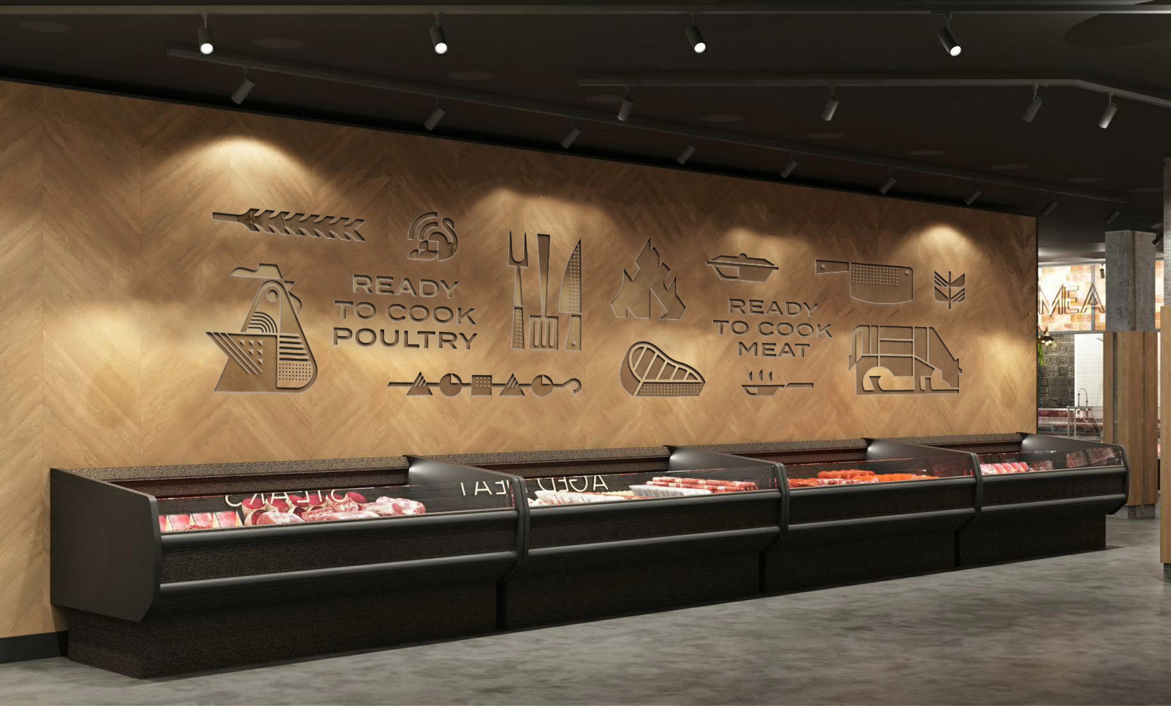
We raised the bar, branding Rosemary as a supermarket that offers impeccable service, absolute cleanliness, and gorgeous amenities at a level previously only delivered by the hospitality industry.
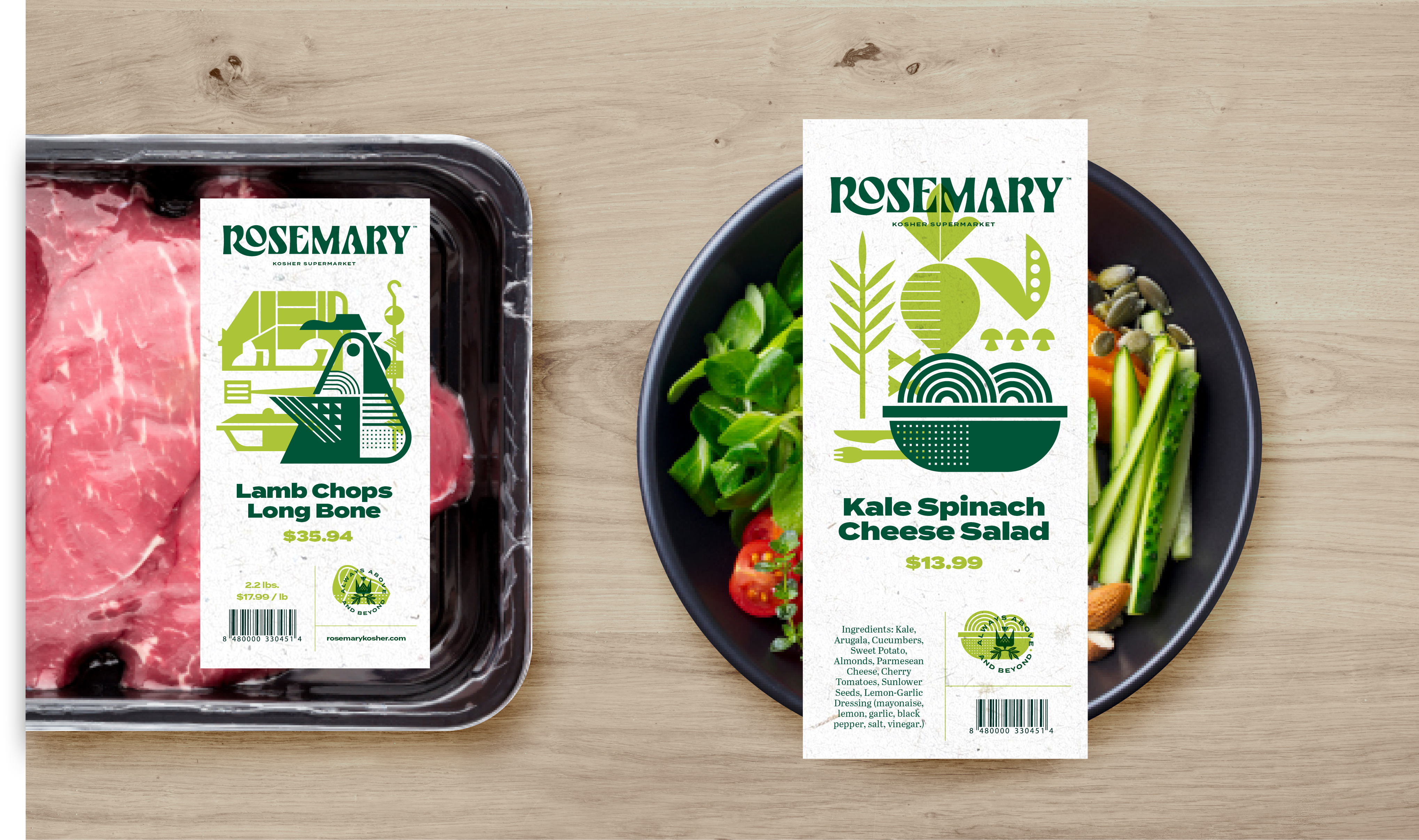
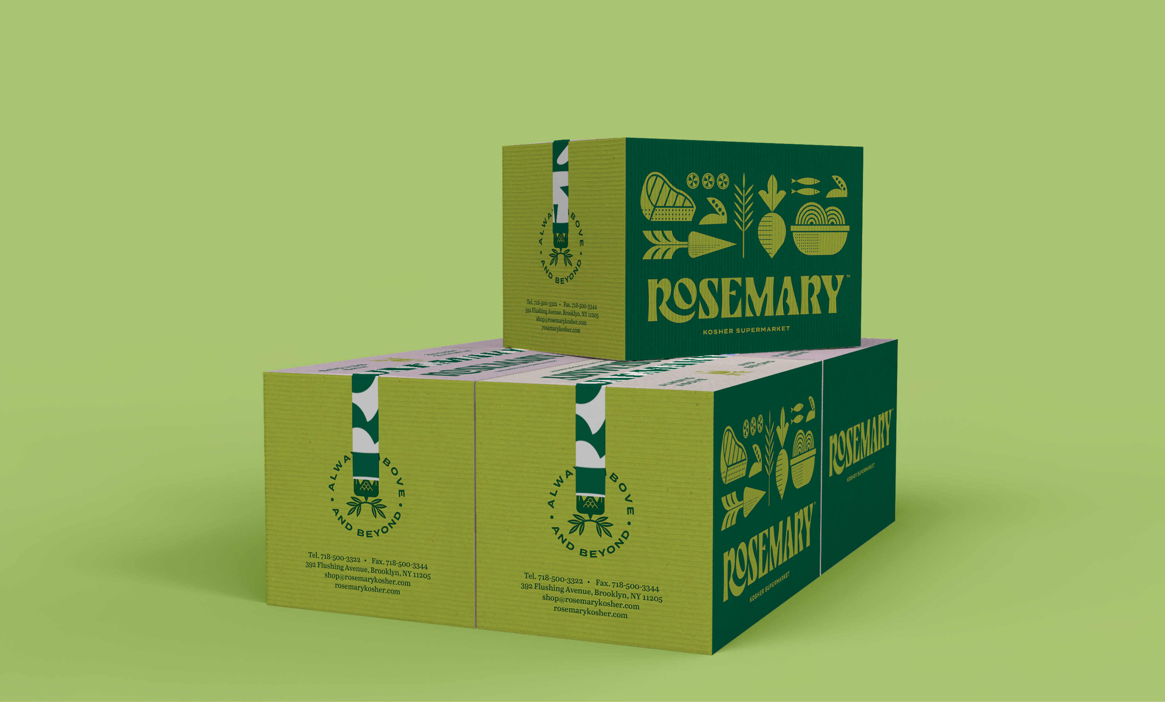
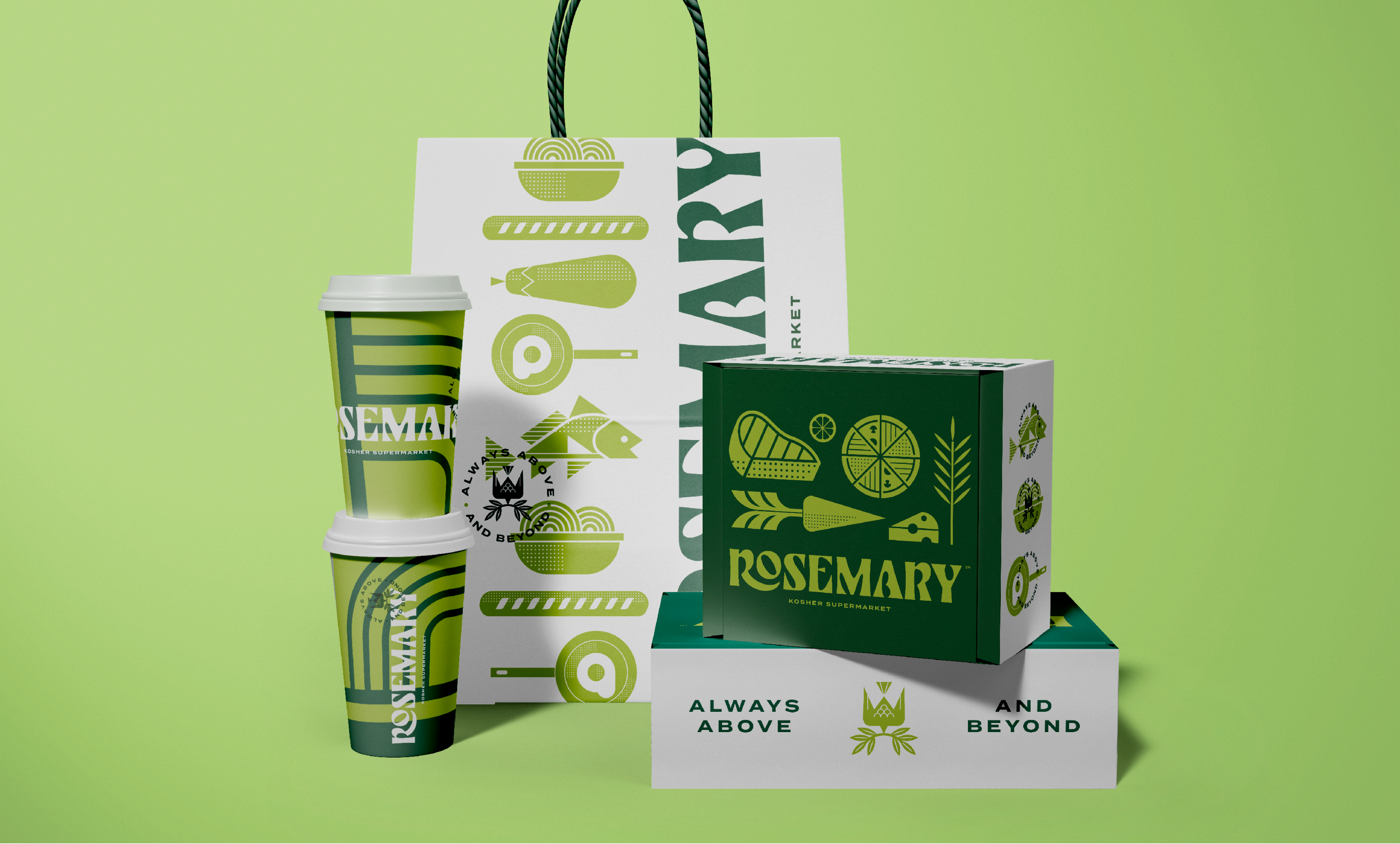
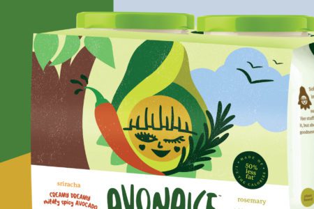
Using artistic iconography and a beautiful color palette, we created a design language that portrayed Rosemary’s finesse and attention to detail across all touchpoints.
The result? A shopping destination where customers walk out wowed, satisfied by the ultimate selection in kosher shopping, and gratified by their outstanding experience.
Heart & Soul Overload
We know you want a peek, but the amount of heart and soul poured into this project is simply too much for the screen to handle.
While we figure this out, fill out the form below and we'll gladly take you behind the scenes.
You can expect a call back within 1 business day


